MŁYN SZADEK
2025
KLIENT: MŁYN SZADEK
BRANŻA: SPOŻYWCZA
W SKRÓCIE: STRATEGIA MARKI, IDENTYFIKACJA WIZUALNA, PROJEKTOWANIE PRODUKTU, AI CREATIVITY

Kto jest klientem?
Młyn Szadek - polska marka z tradycją sięgającą 1921 roku, specjalizująca się w produkcji mąki. Od pokoleń obecna w polskich domach, kojarzona z naturalnością, rzemieślniczą jakością i rodzinnym ciepłem.
strona internetowa ->
Wyzwanie
Naszym zadaniem było odświeżenie opakowań i identyfikacji wizualnej znanej regionalnie mąki szadkowskiej. Celem było uhonorowanie jej dziedzictwa i zachowanie rozpoznawalności wśród wieloletnich klientów, którzy darzą markę zaufaniem od lat, a jednocześnie nadanie jej klasycznego, odnowionego wyglądu - ciepłego, wiarygodnego i wiernego tradycji.
Rozwiązanie
Stworzyliśmy odświeżoną identyfikację marki - w tym nowe logo i linię opakowań - zachowując jej autentyczność i dziedzictwo. Projekt opiera się na prostocie, przejrzystości i ponadczasowych elementach wizualnych, które przywołują atmosferę domowego ciepła i pieczenia, jednocześnie nawiązując do pierwotnego, dobrze znanego wyglądu mąki Szadek.
Identyfikacja wizualna
Logo bezpośrednio nawiązuje do wizerunku młyna - miejsca, od którego wszystko się zaczęło. Symbolizuje serce rodzinnego dziedzictwa, rytm pracy i tradycję przekazywaną z pokolenia na pokolenie. Towarzyszący mu slogan „Mąka, która łączy pokolenia” podkreśla, że produkty Młyna Szadek to coś więcej niż mąka - to symbol wspólnej historii i codziennego, rodzinnego życia.
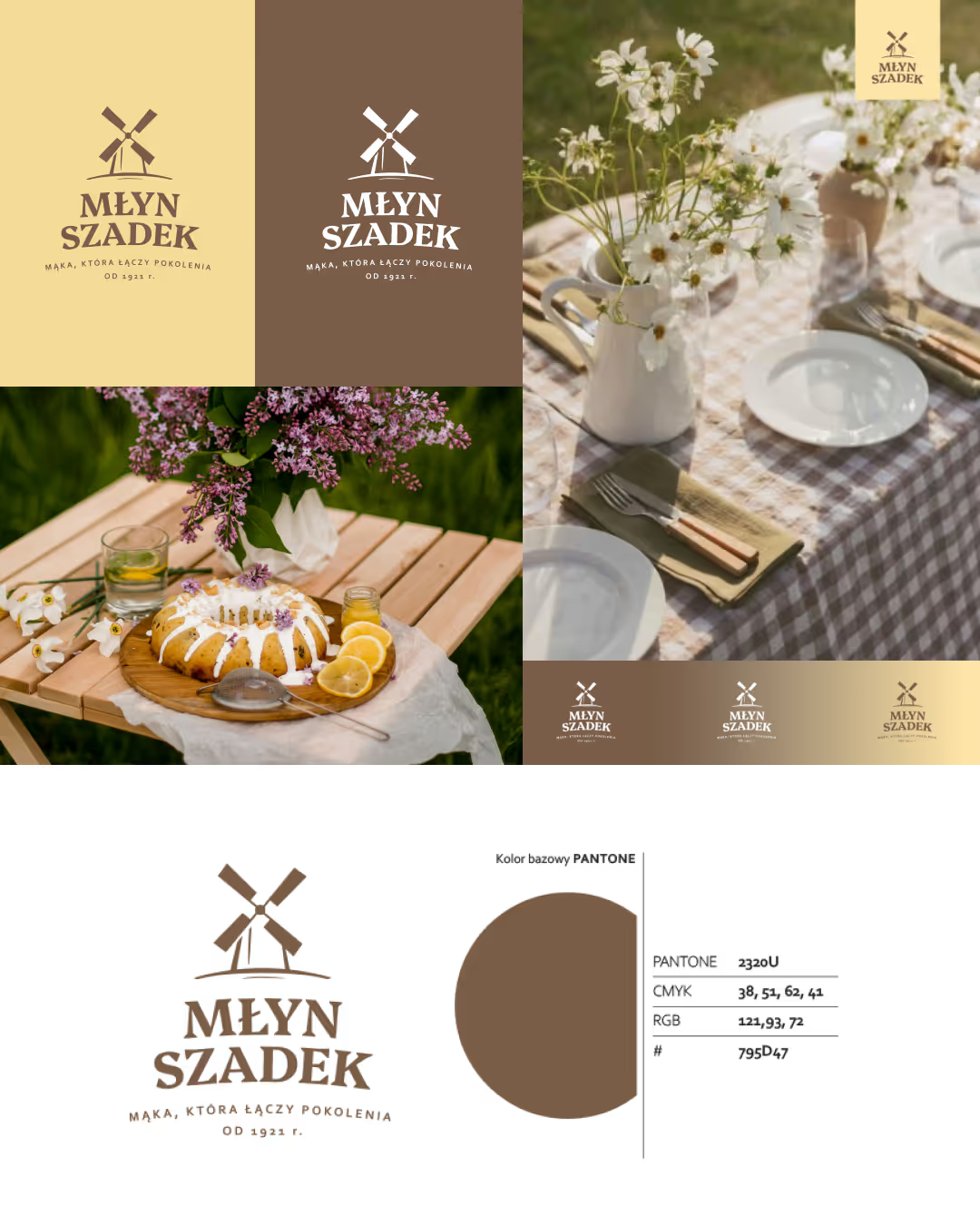
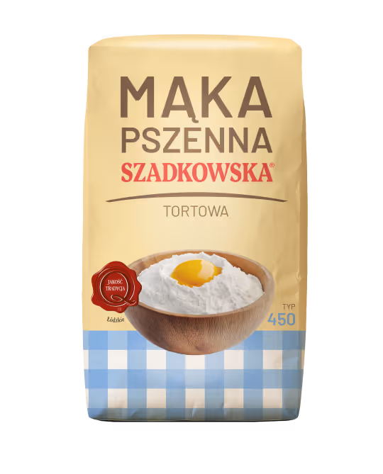
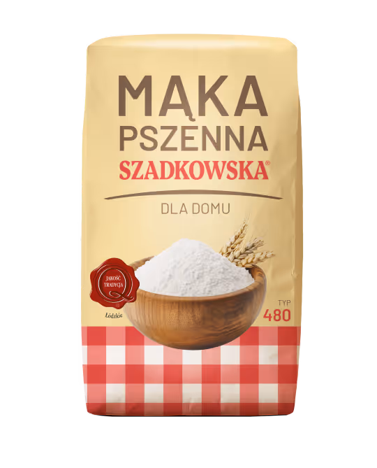
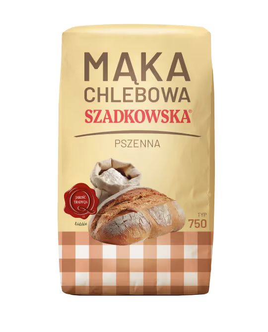
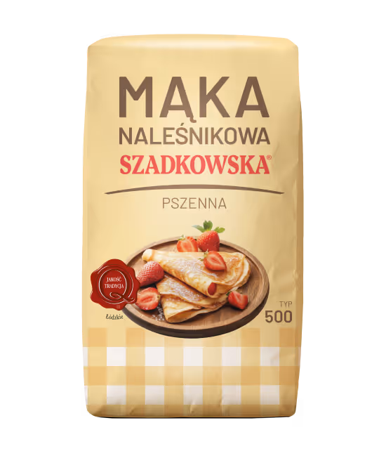
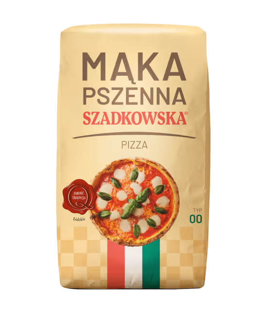
Projekt opakowań
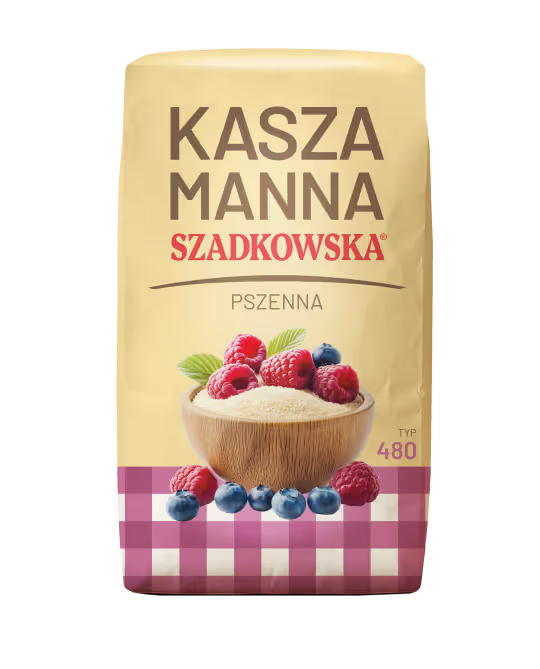
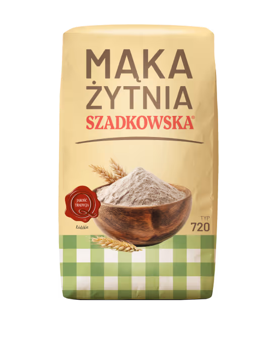
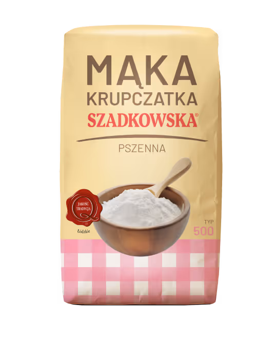
Linia opakowań została opracowana tak, by odpowiadać zarówno potrzebom klientów indywidualnych, jak i profesjonalnych odbiorców z branży spożywczej. Dla domowych użytkowników stworzyliśmy odświeżone opakowania konsumenckie, które podkreślają tradycję, ciepło i łatwość rozpoznania dzięki klasycznemu motywowi kraty w ciepłych, kuchennych kolorach.
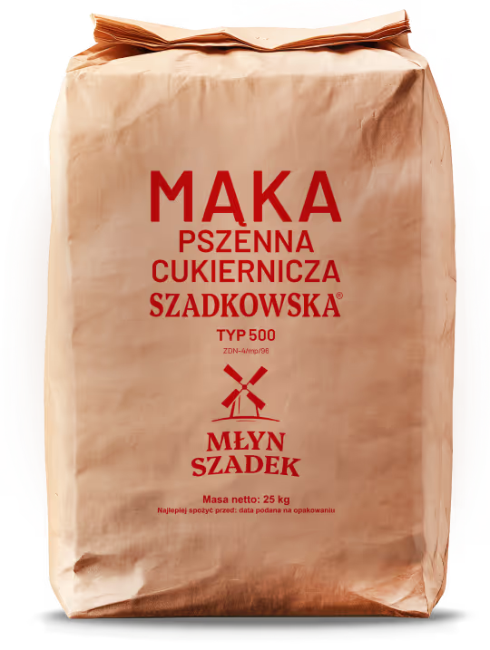
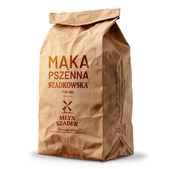
Dla branży piekarniczej i cukierniczej zaprojektowaliśmy trwałe, wielkoformatowe worki papierowe, łączące funkcjonalność z konsekwentnym wizerunkiem marki. Dzięki temu produkty Młyna Szadek pozostają spójne i rozpoznawalne w każdym segmencie rynku.
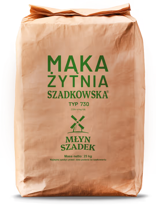
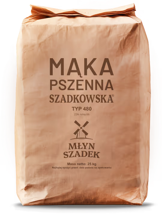
MĄKI PODSTAWOWE
MĄKI FUNKCYJNE
Rezultaty
Odświeżona identyfikacja nadała marce Młyn Szadek spójny, klasyczny i autentyczny wizerunek. Nowe logo i opakowania uhonorowały jej dziedzictwo, jednocześnie czyniąc produkty bardziej atrakcyjnymi i wyróżniającymi się na półce. Dzięki temu marka wzmocniła zaufanie wśród lojalnych klientów, zachowała swój regionalny charakter i podkreśliła ponadczasową wartość produktu, który od ponad wieku łączy pokolenia.